
I often tour friends around when they visit. Depending on their interest or career, our conversations would vary widely. Each would also be particularly looking at what they relate to most while we walk around. For example, two architect friends were very impressed with the city’s many architectural styles. Sure, I’m aware of a few and can probably identify some on first glance, but it was impressive how they do so easily for every famous building.
Another visitor works as a graphic artist, and he kept commenting on the logos, typefaces, and fonts – which were confusing at that time even though I often work related to picking out print styles and designs for many blogs for years. Both tours were fun for me, as I often admire architecture and logos but got no one to talk to about them with.
Later on, I would start to pay attention to the signs, and lettering whenever walking in a different city. These included street signage, underground signs, store logos, and many more. And I think that really, fonts and typography in general probably have subliminal meaning in them.
Table of Contents
Typography, Typefaces, Fonts
Most often than not, we hear typeface and font used interchangeably, and I get confused between these two at times.
Technically, a typeface describes a particular style of lettering, a font on the other hand, refers to variations of a typeface, like its size and weight. That said, Arial, Verdana, Lobster are typefaces. Arial Regular 9 point, Verdana Italic 40 point, and Lobster Bold 26 point are fonts. Combined, typeface and font = Typography – the art and technique of arranging them, picking color, to make written language legible, readable and also appealing when published or displayed.
As we’re not really speaking as designers and people in the printing industry at this moment, let’s use “font/s” to refer to the typography of signages and names in the logos found in cities.

Branding
Branding is defined as the process of creating a presence, a positive perception of a company, its products or services in consumers’ minds by combining such elements as logo, design, mission statement, and a consistent theme throughout all marketing methods. Take the Waltograph, which is Disney’s font – we recognize it easily at one glance.
Over the years, we’ve seen branding being implemented by cities. City branding (or urban branding) refers to all the activities implemented by city officials with the purpose of turning a city from a location into a destination to encourage people to visit, even work, and live in. Doing so leaves a particular image in a person’s mind that he/she can recall once seen.
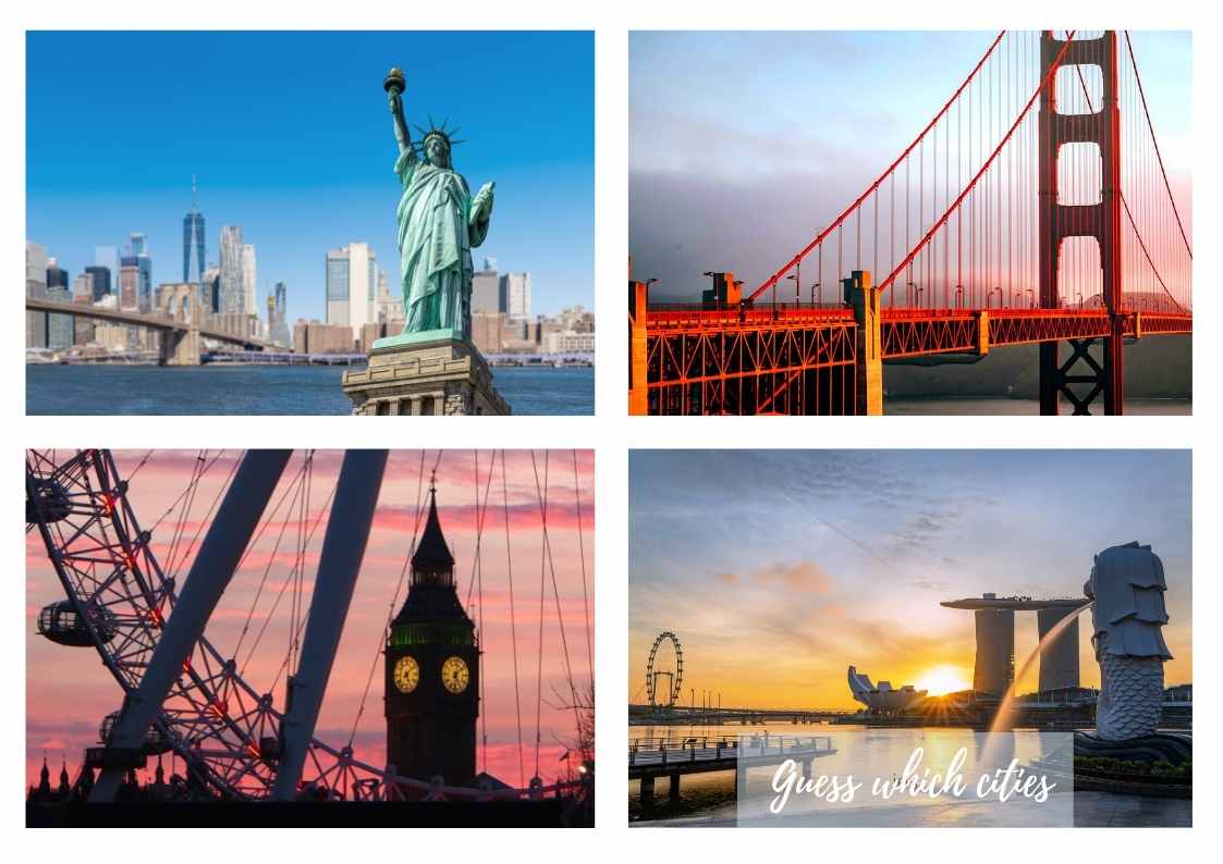
City landmarks are the most commonly used images for city branding. It can also be derived from existing assets of the city such as history, events, policies, abstract concepts of tolerance, and other significant aspects. Most of the time, we see city nicknames becoming a sort of brand. Here are some of the famous recalls and nicknames we would immediately recognize when heard.
Amsterdam – “WE Amsterdam”
Las Vegas – “Sin City”
New York City – “I Love New York”, “Big Apple”
Paris – “Illuminated City”, “City of Love”
Rome – “Eternal City”
Seattle – “Emerald City”
Singapore – “The Lion City”
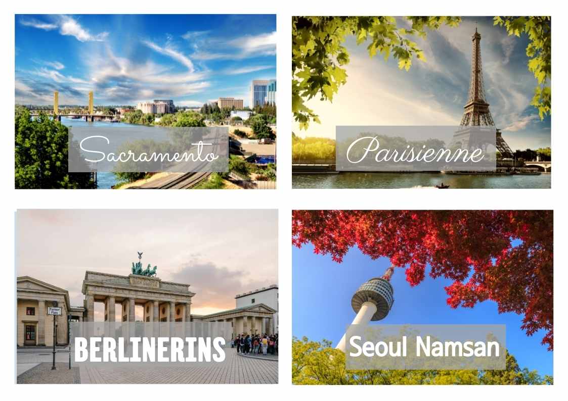
In efforts to redefine a destination, some designated departments chose, created, or commissioned their own typography – some of which were named after the city or a derivative of. Here are some:
Berlin –
Berliner –
Berlinerin –
Chicago –
Geneva –
Sacramento –
Stockholm Type –
Milano City –
Eindhoven –
Parisienne –
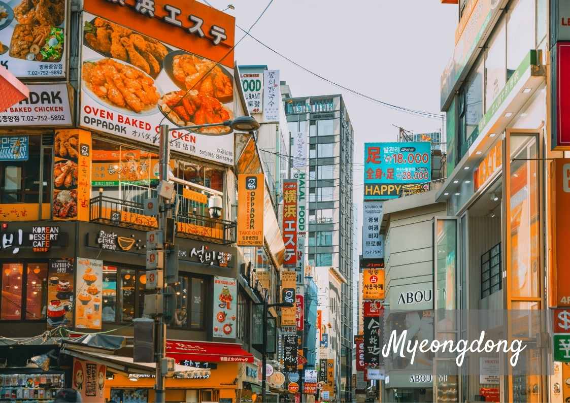
Many cities have centuries-old signage etched not only in history and people’s memories but on weather-resistant materials. This too adds to how a city is perceived and remembered both by locals and tourists.
Subliminal Meaning
Fonts can evoke emotion and provoke a familiar reaction and can thus be used to make a brand feel more trustworthy, relatable, friendly, or inspirational. Designers know that we all respond to visual culture in an emotional way and they use this knowledge to influence viewers’ responses with the use of fonts, colors, images, and logos.
For example, a bank normally wants to be seen as stable, opting for a traditional serif font will have this effect, while a tech start-up is better with futuristic sans serif font, to give off a perception of innovation.
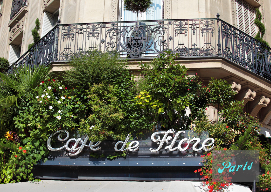
Script/Cursive Signage
In handwriting, cursive is a style of joined up handwriting in which the letters are connected as opposed to block-letters, in which the pen is lifted between every letter. Cursive style can also be called joined-up handwriting or script handwriting, at times also, almost called calligraphy.
We all have our quirks and style when writing, and it says a lot about our personality. Experts say learning to write in cursive has good effects to the brain which also supports cognitive function and development. Writing notes in cursive, or in general, is a good practice that can help ease symptoms of dyslexia, according to the above article.
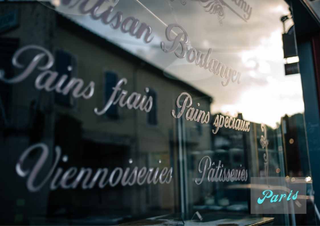
Cursive writing represents an era where communication was given a lot of time and thought, when writing letters are more personal and when having beautiful handwriting mattered. Now, seldom we see cursive style print on signages, there’s probably not a lot compared to print or block letters. However, Paris, the city of Love has a lot of them, it’s probably why the city emits a romantic atmosphere.
Legibility and Safety
Typography can save your life. Warning signs when printed small and not easily noticeable might be overlooked, especially in hazardous areas.
If texts aren’t legible, it can cause not only confusion, but perhaps accidents too. That’s why font type, font weight, point size, and point size contrast between the signal word and other components of the warning is important when printing. Even putting texts on caps lock can have an important message. People will recognize how it’s important being on caps lock, but because it also has the connotation of being shouted out, our psychology might try to desensitize the really important messages.
City Character
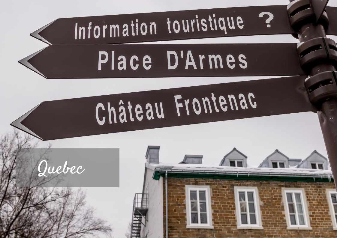
All in all, a city’s character is brought about by history, what it represents, the natural layout, and the visual representations, sometimes not purposely, that the citizens and its government contributed. And here, signage, fonts and typography also play a big role.
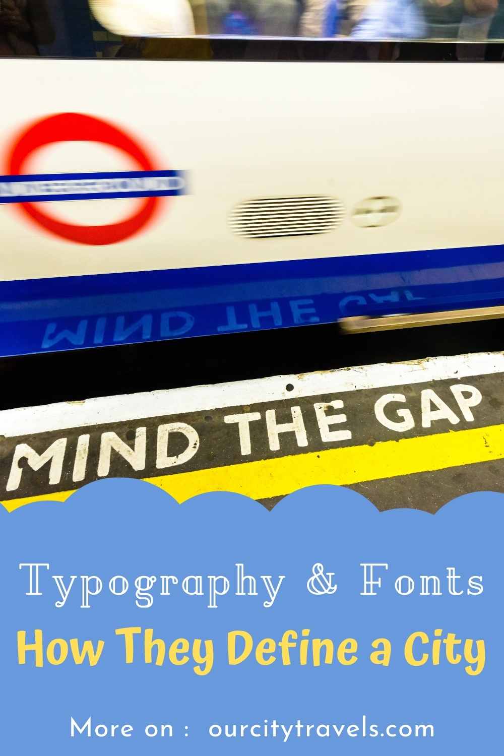
Big cities like London, New York, Berlin, and Paris have characteristics set through all the above-mentioned facets. One can easily recognize train station warnings, reminders, and announcements even when printed on platforms or heard as a recording.
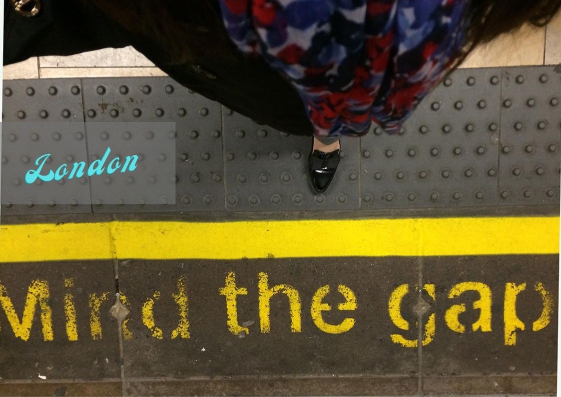
London’s “Mind the Gap” is perhaps the most famous recall among such reminders. It was first introduced in 1968, and is now also used by transit systems worldwide, particularly when there are stations on curves.
Of course, Paris’ Eiffel tower is not to be missed, it’s easily one of the world’s most famous icons and even though replicated, nothing comes close to its grandeur. Along with its other awe-inspiring architecture, Paris’ Art Nouveau metro entrances are truly notable. Designed by French architect Hector Guimard, the typography on these entryways have symbolized the city’s Golden Age of art and architecture, and is still captivating for us, a century later. In all of France, Caractères (French for characters) is a name of a sans-serif typeface family for road signs there and also in Monaco. By its name alone, the typeface has given France a particular character.
Which city do you fondly recall in connection to your favorite typeface? Let us know in the comments.

This was a cool read. I always love learning new things–I didn’t realize all of this but it makes sense 🙂
This was cool to learn. I so agree with this info.
I never really paid attention to street signs font. But it drives me crazy because most street signs are too small to read until you are super close to it unless you are following a gps. I’ve seen some cities have started making the font bigger so it’s easier to read. I hope they do it to all street signs.
I have never really paid attention to the fonts but I now realize that I recognize them at certain places like banks as you mentioned. That is so interesting.
This is really interesting and cool thing to learn! I enjoy reading this thanks for sharing this with us
I have learned a lot over the years about fonts. My friend is a graphic designer and it drives her crazy when certain fonts are used. They really can speak volumes.
wow! I found out so many new and important things from this post. I’ve never gave the right importance and attention to these things and details!
I’ve never seen a place like this before! I appreciate you sharing your photos with us. It feels like I am there too.
I love the different feelings that fonts give off, and I enjoy using fonts in designing graphics. This is such a great piece to think about!